Kelli Mansfield
UX CONTENT DESIGN PORTFOLIO
Hi I'm Kelli Mansfield, thank you for taking the time to view my portfolio. I’ve spent the last several months learning everything I can about ux writing and really feeling like I have a solid starting foundation in this. I have read books, articles, watched YouTube videos I’ve reached out to a few ux writers who I admire and have actually received feedback from them. I actually started out learning about ux research before I found ux writing, so that was originally what my portfolio was based on.
I understand the reason for ux writing. I understand what its importance is, who the people are I would want to work closely with during a project and why. I understand writing is based on research; we don’t write from a personal standpoint. We write to solve problems and write from a user and company perspective to make sure we are creating a product or enhancing a product that not only meets the needs of the user but also the company or brand.
ONE:
UNIVERSITY TUTOR APP
project one
UNIVERSITY TUTOR APP
creating a seamless experience
A college university wants to revamp its current tutoring portal to an app. Research was done to decide if this is even ROI positive for the University and also if there was an actual need from students for some kind of update.
Two research methods were utilized -
- University wide survey
- Campus usability tests of the current portal
Research Goals:
- To understand the impact tutoring has on students.
- To see how they feel about the current online tutor portal process.
What we found -
Students do find tutoring useful in helping them succeed in classes. But they want it to be better and more accessible and user friendly. Usability testing confirmed what kind of usability issues are taking place within the current system.
Original Web Tutoring Portal
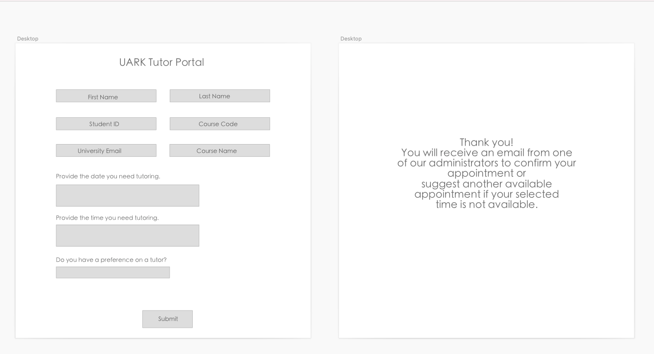

TUTORING PORTAL
ISSUES
PROBLEMS WITH CURRENT PORTAL
- multiple input fields to fill out manually (all are required to submit).
- tutor web portal not optimized for phone use - input fields tiny and hard to read.
- research observation: points in the process where students had to leave the portal to retrieve a course code that they may or may not find.
- research found that majority of students benefit from tutoring but the current system isn’t accommodating.
- students have to wait for several hours to the following day for tutoring appointment approval.
- no control over appointment times or days.
- no availability for remote tutoring sessions.

ux writing portion
WHAT I DID
Based on the research results, I began to create the conversation for this particular flow - (scheduling a tutor appointment).
This flow needs to answer the following:
- I need to schedule an appointment.
- I need to schedule a remote appointment.
- I want to choose what time works best for me.
- I want to be able to reschedule or cancel my appointment.
- I want this experience to be quick and easy.
APP GOALS
To allow students the control to schedule and secure a tutoring appointment on their own, focusing on a simple and straightforward process.
IMPACT OF PROJECT
The University wants students to be successful in their courses. Therefore, top notch tutoring and success tools in general directly impact the university's' ability to rank well. The better the students perform, the better the university is.

VOICE GUIDE
SUPPORTIVE
Language should be quick to help students get to a next step without them questioning what they need to do next or going out of their way to do the next thing.
SIMPLE
Use language in a way that makes an experience easy, quick and effortless. Simple but not boring.
ENCOURAGING
Students have enough going on in their day to day, how we speak to them throughout their digital experiences should reflect encouragement, but not overly cheery.

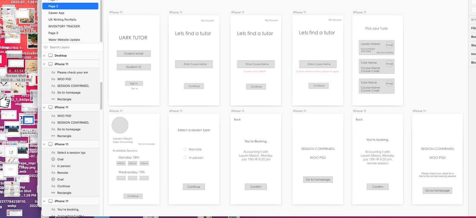
New Tutoring App
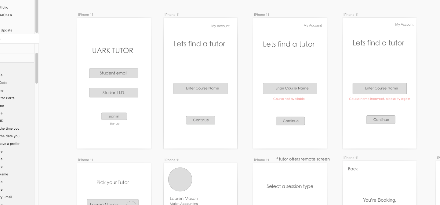
Example: Calculus ll
- Students enter in their course name, instead of their course code which is more difficult to find as observed in the usability tests
- Simple onboarding process
- helpful tips in case they enter in something wrong

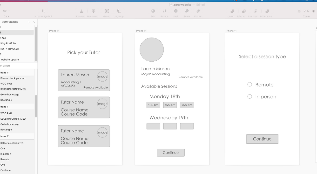
Accessibility is key - added the option for tutors to offer remote sessions which tags along to any in person session they're offering.
Give control to students to choose the time that best works with their schedule, instead of waiting to be approved for a session like in the old online portal.

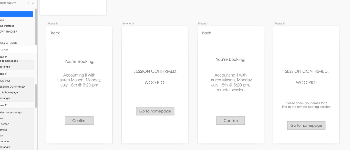
These screens show two options of confirmation pages, one if you're booking the remote option and the other if you're booking in person.

Booking Appointment Flow Wireframe

TWO:
WEBSITE BUILDER

WEBSITE BUILDER
redesign of a simple but critical task
project TWO
OVERVIEW
A new website building service lets individuals and businesses create their own website using premade templates for the purpose of having their own online storefront for their clients to purchase product through.
Disclaimer - This project is based on a real product I had access to and these were real issues. I used friends to test out the system.
CONCERN
Customer and tech support inquiries have received influx of repeated complaints about not being able to upload hero space banner images (main images of a landing page) and coincidently they have experienced more membership cancellations.
RESEARCH METHODS
- Moderated usability test - with look-a-like testers - these participants could not ultimately find where to upload their images.
- Tree test - revealed most participants clicked on “Pages and Menus - Banners” because they associated banners with images. The correct tab to start the process of adding banners is “Media Library” which didn't resonate with participants.

*14 STEPS TO UPLOAD HERO SPACE IMAGES
Represents the actual steps
Click on: Media Library (top of page)
- Click “upload media” button
- Right click on small image you just added
- Click “copy image address”
Click on: My Sites (top left of page)
- Edit Site
- Advanced Page Manager
- Edit Page
- Click on drop down box, select “home page”
- Click the 2nd text box
- Edit
- Right click on image currently in there
- Hit “properties”
(Box pops up)
Copy link of image in source box
Save - image (s) will now be uploaded on hero space

CONTENT DESIGN PORTION
WHAT I DID
Based on the research results, we needed to refigure the 14 step process - make it simple with way less steps. It also needs to be where users assume it will be. With this in mind I:
- redesigned the page most users clicked on to upload their images to in fact, be the page where that can be done.
GOAL
Provide a seamless and quick process for uploading brand hero space banner images so customers can complete their website and utilize it.
IMPACT (USER+BUSINESS )
If users cannot upload hero space banner images to their landing page, they can't set up the rest of their website. The landing page is the single most important customization area of a website and hero banner images establish brand value. Without it, users cannot complete the process and make their site live. In this case, they cancel their membership which means the service loses customers.

ORIGINAL SCREEN
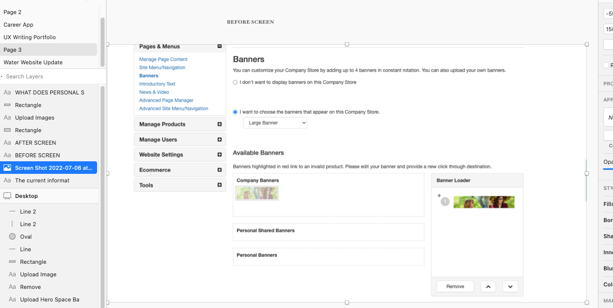
- Confusing text
- Nothing uploads to "company banners, personal shared banners, or personal banners."
- Clicking on drop down menu for Large, Medium or Small banners doesn't seem to effect size anywhere
- Banner loader does load banners, but to where, nobody knows
- Overall this isn't even the correct page to upload the banners to but this was the page most participants went to to try to upload them.
Original screen - where most participants clicked on to add their banners. Reminder that this is not the correct area to do this even though it looks to be.

Redesigned Screen
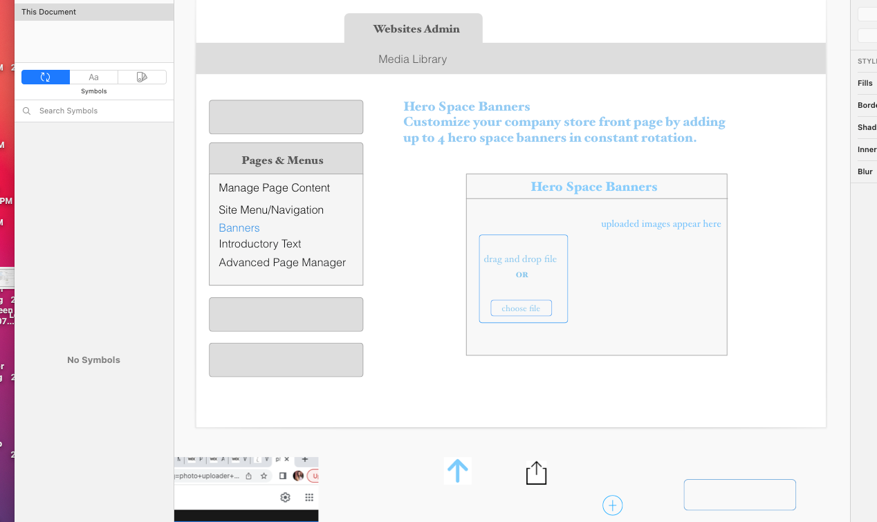
- Page only contains the one important thing people need to do here - upload hero space banner images.
- Text is now clear, concise and helpful.
- Users can now easily drag and drop in their images or simply upload them.
- Instructions are straightforward, there is no confusion what this page is for and no 14-step process.
- text in blue is what I created/changed.

THREE:
RETURN LABEL BOT EMAIL

project THREE
RETURN LABEL BOT EMAIL
I created a bot email that focuses on a specific task, which is to download a requested return label for an order from an online store.
Question: What does the user need from this email?
Goals for writing a bot email message that contain the prepaid return label
- inform customer this is a bot.
- inform customer their label is attached.
- inform customer of additional ways to reach customer support
that the bot cannot answer.
- if for some reason email didn't attach the return label give instruction
on how to request missing return label.
- overall, keep message clear and to the point, ultimately supporting the user in easily
returning their purchase.

Final email
Hi Danielle,
My name is Jenna and I'm a bot!
Attached is the return label you've requested. All you have to do is simply print it out, attach it to a box and take it to your nearest FedEx location.
If you don't see the return label, please click this link to request another one. If you need additional assistance click here to connect with an assistant who can better answer your questions!

FOUR:
APP SIGN UP SCREEN

project FOUR
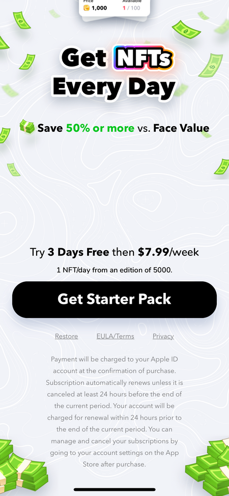
APP SIGN UP SCREEN FINE PRINT MESSAGE
(screen edit of current text)
UPDATED MESSAGE
Once you confirm your purchase, Your subscription will activate and you will be charged after this 3 day trial period. To manage this subscription, go to your account settings > Apple ID > subscriptions.
ORIGINAL MESSAGE
Payment will be charged to your Apple ID account at the confirmation of purchase. Subscription automatically renews unless it is cancelled at least 24 hours before the end of the current period. Your account will be charged for renewal within 24 hours prior to the end of the current period. You can manage and cancel your subscriptions by going to your account settings on the App Store after purchase.
Updated text:
- Text is now clear and concise
- Informs the user of exactly what they need to know in a simple, effective way
- Removes any fluff text that doesn't serve a purpose
Original text:
- Too lengthy, too many words
- Text is repeating the same message
- Text is confusing
- We don't want to encourage people to cancel, but we want them to be informed of their options

FIVE:
INSURANCE CLAIM PROCESS

project FIVE
Unemployment Insurance Continued Claims
OVERVIEW:
The state Unemployment office recently announced that they have closed all local offices in the state which therefore closes all local customer service phones. They have replaced this with one customer service hotline number for the entire state. This has caused the following issues.
PROBLEM:
Customers getting knocked out of their weekly unemployment claims - if they forget to file their weekly claim online after the cut off on sunday between 2 and 5 pm they will be kicked out and have to reapply for unemployment claims through calling a hotline number.
COMPLAINTS
Multiple customers report being hung up on/the line disconnecting them each time they call. The ones that are able to get through have to wait 1-2 hours on the line.
Most people are then missing out on receiving their weekly claim money because of this simple issue that could be fixed if they just had online access to reinstate their account on their own in the event they forget to file their claim within the Sunday time frame.

Solution:
Create online access so customers can reinstate their own account in the event they forget to file their weekly claim on Sunday.
WHAT THE SOLUTION SOLVED
From a customer standpoint - they are losing a paycheck each week they cannot get through to the hotline number to reinstate their accounts. This in turn results in elevated complaints to other related offices and many negative online reviews.
Less phone calls to the hotline number means that the people who do need to call can actually get through. (As some people do not have internet access.)
Prevents the need to hire on a larger number of customer service reps, which would end up costing the company a lot of money.

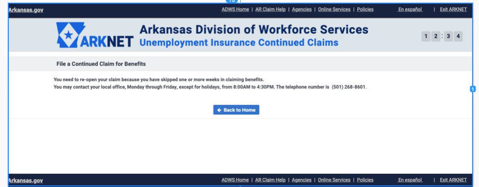
ORIGINAL SCREEN
The original site directed people to call the customer service number. When people forget to file their weekly claim. this is the message that comes up.
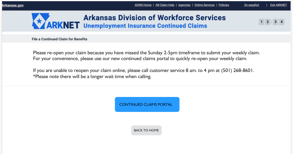
NEW SOLUTION
I wanted to make sure there are no unanswered question in terms of what to do. I wanted to make sure people knew why their claim is closed, but reassure them of a quick way to fix that and also give them the option to still call in the event they are unable to complete this online.